Project Overview
Destiny 2 is a multi platform (PC, Xbox, Playstation) video game released in 2017. Through the years, with increasing amounts of game mechanics and elements added, the Head-up Display (HUD) user interface has become increasingly complicated, less informative, and more cluttered.
The purpose of this project is to re-design the in game HUD (heads-up display) in a few specific pain point areas using the existing Destiny 2 iconography, to relay information to a player in a more complete and concise fashion.
My Role
Identifying pain points within the currently implemented HUD through first hand experience and community resources, re-designing the HUD to address these problems.
Purpose of study
A major pain point in the currently implemented Destiny 2 HUD, a key part of any video games user interface, is the limited rows of game element text readouts. This limitation significantly reduces the comprehension a player may have of their current state in the game; a lack of comprehension can lead to frustration in knowing what is happening within the environment or to the character at any given moment. Increasing this comprehension and available information helps the player feel connected to the game world, their character, and fellow players.
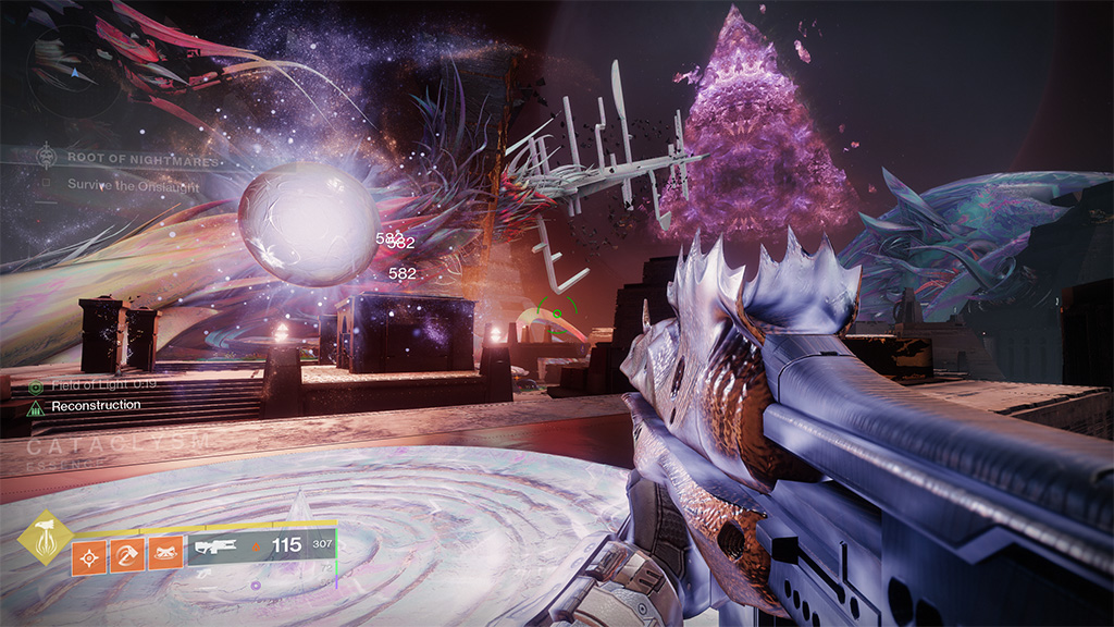
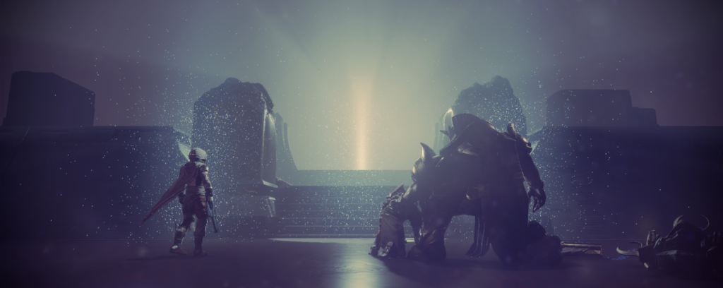
Destiny 2 HUD | Root of Nightmares Raid 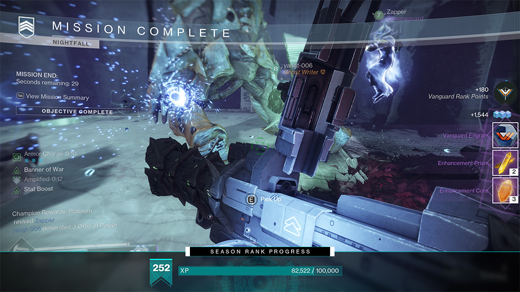
Destiny 2 HUD | end of nightfall activity 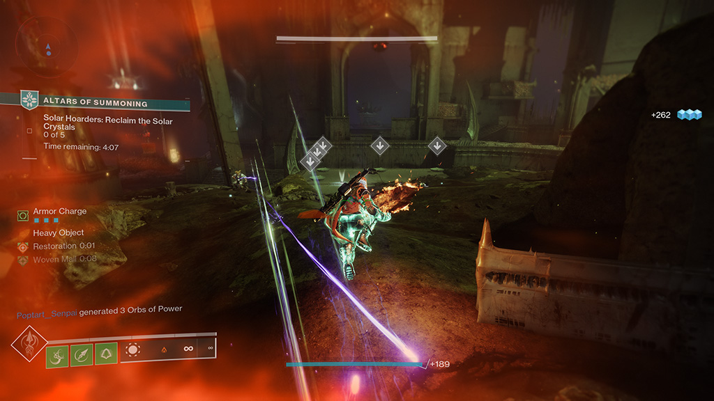
Destiny 2 HUD | seasonal activity gameplay 
Destiny 2 HUD | seasonal activity gameplay 
Destiny 2 HUD | seasonal activity gameplay 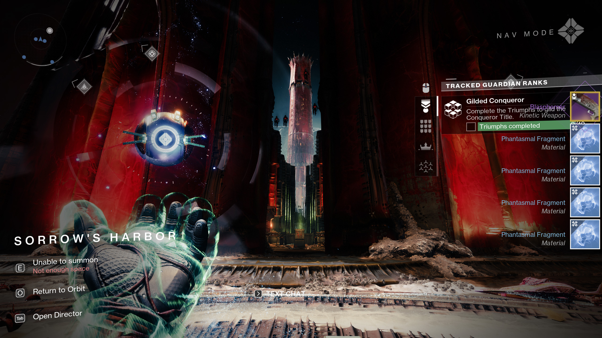
Destiny 2 HUD | patrol zone moon 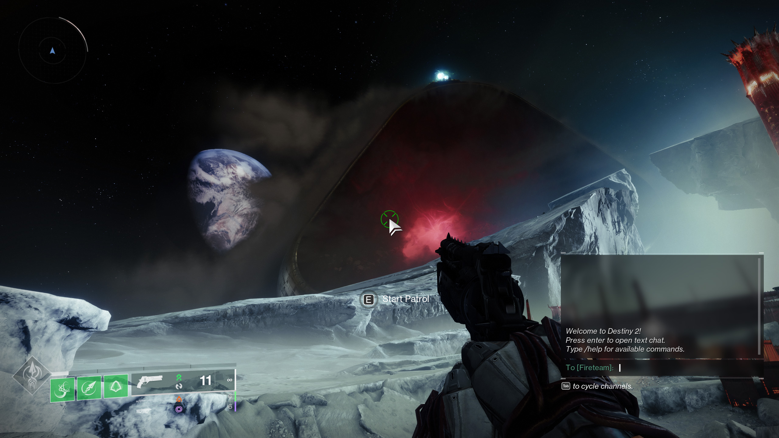
Destiny 2 HUD | patrol zone moon 
Destiny 2 HUD wireframe (not all possibilities shown)
Notes on current HUD:
- HUD can be turned off or minimized in game settings.
- HUD is dynamic based on environmental factors, player interactions, and activities.
- HUD elements are activity specific.
Overwhelming a player with information is mitigated somewhat by the dynamic nature of the HUD. Some elements will disappear over time to clear up the screen, and it is also possible to turn off some features of the HUD within the game settings.
For the purpose of this study, one specific problem area of the user interface (HUD) will be shown, defined, and given a solution.
Defining the problem area
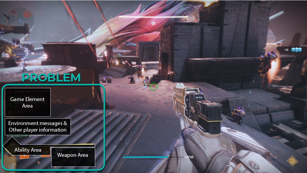
-In the game element location a maximum 4 rows are responsible for relaying:
- weapon perks and traits
- player ability buffs/debuffs
- activity buffs/debuffs
- the armor charge system
- ability cooldowns
-Space under abilities and to the left of weapons is not being used.
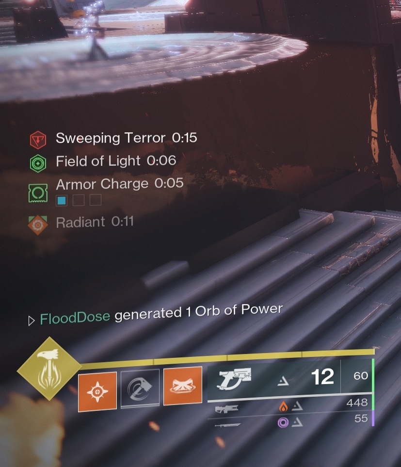
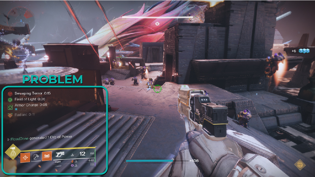
The current system has a coded hierarchy of importance for which game elements will be displayed at the top of the 4 row stack. In the video clip below; picking up the environmental buff “field of light” will push it to the 2nd row of text, just beneath the “sweeping terror” environmental debuff. It appears environmental game skew towards a top priority in the stack, while a weapon perk like “eager edge” which is on the player’s sword and utilized in the video never break into the 4 rows of text.
From this we can determine: 1. There is a hierarchy of information presented 2. Game elements currently “in use” have the potential of never being visually relayed to the player.
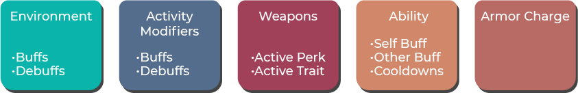
From the information gathered above and play testing, I will place the various types of game elements that might appear into the following buckets:
Solution
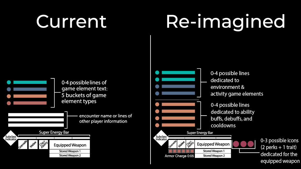
The key importance in this screen region of the HUD is to spread the 5 different buckets of game elements across the entirety of the region:
Environment
- Share a 4 row section with activity game elements in the area that was previously used before for all 5 game element types.
Activity
- Share a 4 row section with environment game elements in the area that was previously used before for all 5 game element types.
- Negative status effects received by a player from an enemy combatant or player should utilize this space
Weapons
- Moved to be inline with the equipped weapon
- Remove text description and focus only on icon
- Remove timers and have icon blink when last few seconds of it being active.
Ability
- Move to dedicated 4 row section beneath environment elements
- ability buffs and cooldowns are continuously turning on/off and need a dedicated space giving them room to flex up in amount when necessary.
- Dedicated space allows players to more comprehension of their build craft loops and could increase a sense of connection to their character.
Armor Charge
- Moved beneath the ability charge indicators; this area is not utilized in the current HUD, and also makes sense since armor charge is predominately used in some conjunction of increasing ability generation or boosting weapon damage.
- Armor charge has a default value of 3 max stacks, but with mods can increase to 6 total.
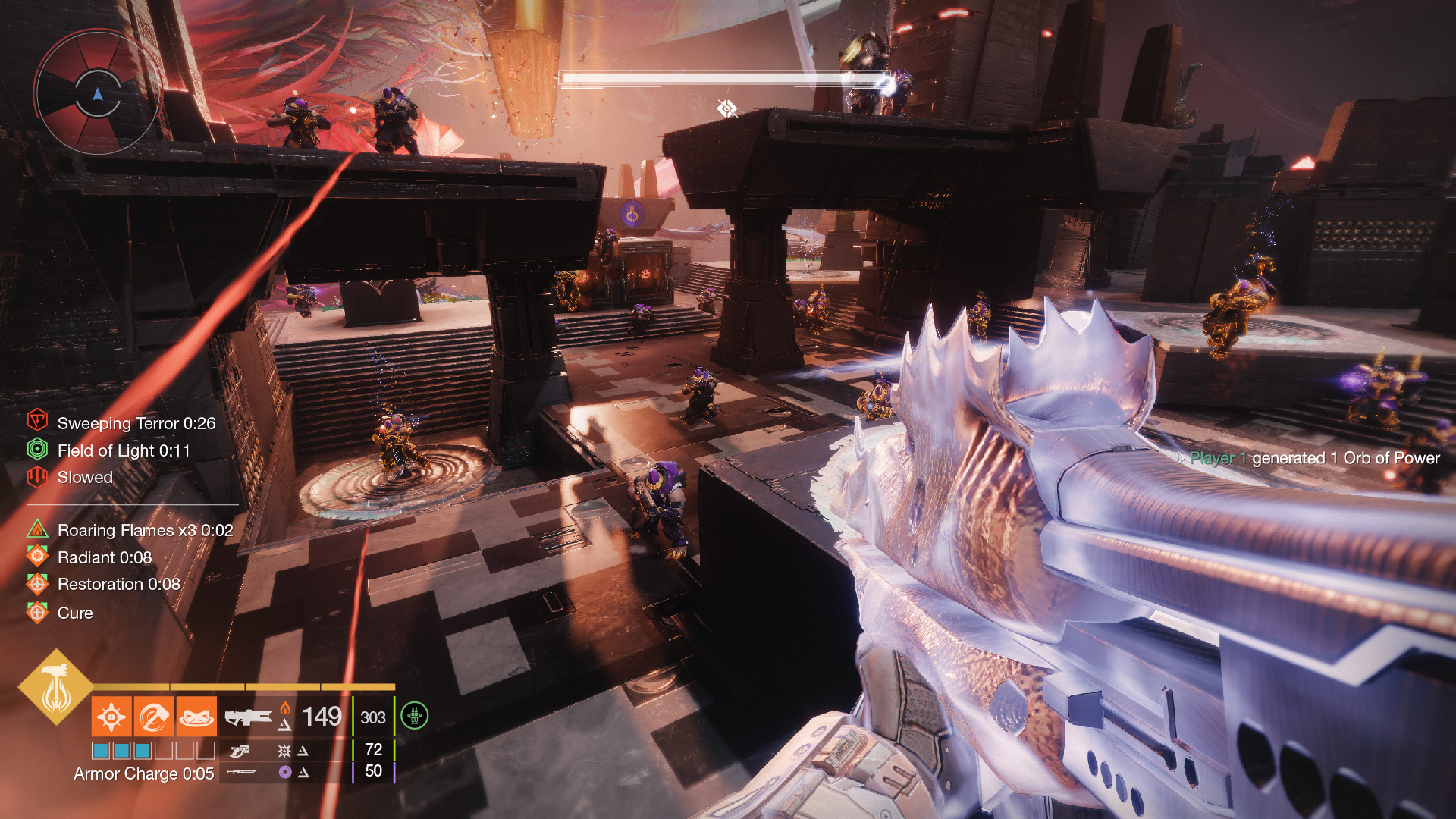
In the above mock up image we have the following information presented:
- Environment debuffs “Sweeping Terror” and “Slowed”
- Evironment buffs “Field of Light”
- Titan solar subclass aspect buff “Roaring Flames x3”
- Solar 3.0 subclass buffs “Radiant,” “Restoration,” and “Cure”
- 3 stacks of Armor Charge
- “Reconstruction” perk active on the equiped trace rifle
Separated out, we have a total of 9 different game elements shown to the player where only 4 would have previously been shown. An over 200% increase with the potential for a 300% increase given the values provided in the start of this section.
The additional section to abilities is the only change that displaces other elements. Specifically the location, encounter name and/or other player information section just above the abilities section. In the mock-up above this location change is shown by the text on screen of “Player 1 generated 1 Orb of Power.” This location move sits the new area above where in-game text chat is displayed (bottom right quadrant of a player’s screen), since currently that section is not heavily utilized unless the player goes into “nav mode,” pulling out their ghost shell. Although, in “nav mode” these lines of text disappear from sight in the HUD even now in their currently placed location, so in reality there is no negative change. It remains a lateral change at most.
Conclusion and Next Steps
The changes to the user interface in this way is subtle, but the amount of information that this would provide to the player could be 3x greater with very little movement to pre-existing conditions of the HUD.
In a team environment I would present my findings and look for feedback to further refine and reiterate. Not having a full understanding of the coding aspects of the game limits my ability to know what is and is not a “minor” adjustment to the HUD, but the purpose of this particular exercise was to demonstrate an understanding of complex systems and implement an elegant solution into an already pre-existing design ecosystem.
In addition, Destiny 2’s live service component and consistent updates to game elements makes it an incredibly fruitful environment to explore concepts of UI/UX.