UI/UX Design
Project Overview
The Product
Many Hands Homeless Shelter is a made up non-profit serving the homeless community of the Northern Nevada: Reno / Sparks region. The users will be community members interested in donating, volunteering or learning more about homelessness in the region. This is the final project I completed to receive my Google UX Design Certificate.
My Role
UX Designer / Brand Creator / Graphic Designer
My Responsibilities
Conducting interviews, paper and digital wireframing, low and high-fidelity prototyping,conducting usability studies, accounting for accessibility, and iterating on designs.
The Problem
Rising housing cost, wage stagnation, and a global pandemic is leading to a rise in homeless people across the country.
The Goal
Design an app & website that allows users an easy portal to donate, volunteer, and/or learn more about the homelessness problem in the Northern Nevada region.
1. Understanding the user
User research: summary
Interviews were conducted and empathy maps created to understand the users and
their needs. Taking the pain points vocalized in the interview process, personas were created of key user
groups to further distill the design problems. The key takeaways from the interviews were:
- Making the donation process to a homeless shelter needs to be as simple as possible
- The more transparent the shelter needs, the better
- More information about the shelter was always wanted
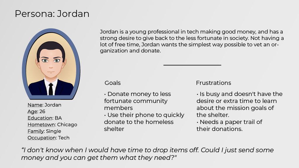
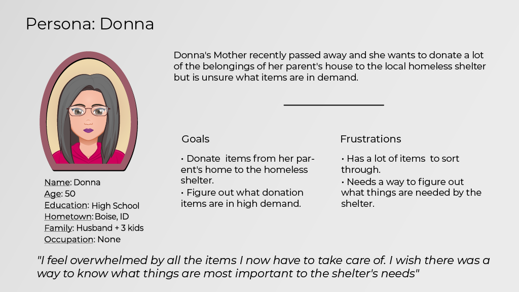
Personas
2. Starting the design

Usability study parameters:
Un-moderated usability study
United States of America, Remote
5 Participants
15-20 Minutes
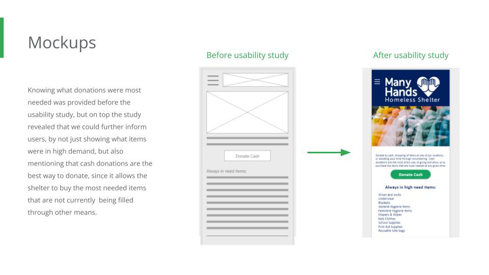
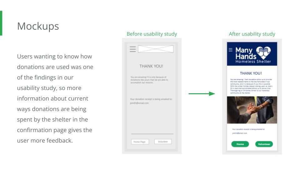
Key findings from the usability study:
- Users want to know more about what items are needed and what is the best things to donate.
- The users would like some feedback as to what their individual contributions accomplish at the shelter.
- Some users reported feeling the theme of homelessness causes them anxiety and guilt, so finding ways to make the experience feel uplifting and positive could increase positive user experience.
3. Refining the design
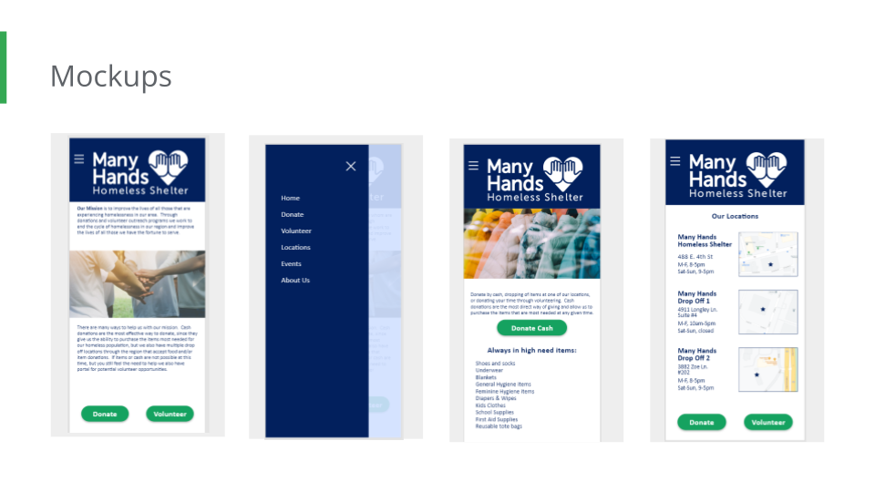
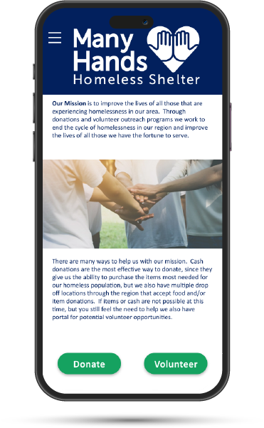
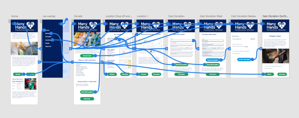
Hi-fidelity prototype:
HiFi Prototype: The main flow within this prototype is to show how a user would make a cash donation, and also find the locations to make in-person item or cash donations.
Accessibility considerations

Design uses a single column layout so screen-readers are able to flow in linearly down the page for visually impaired users

High-Contrast colors are used in order to help legibility for visually impaired and devices that do not have a good resolution.

Increased negative space so user can sized up text if needed within device settings. Helps both with visually impaired as well as responsive design.
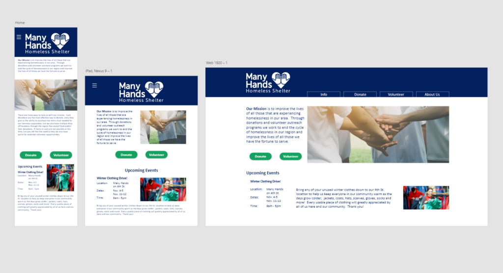
4. Responsive design
Going forward
Takeaways
Impact:
During the course of the design project start, there has been even more coverage about the growing crisis facing the U.S. over homelessness. Their is a lot more room for this project to grow into something bigger or to get real world interest.
What I learned:
I learned that there are very few mobile apps that deal with homelessness in general, and none at all that deal with homelessness in the region the design project is serving. Information gathering was vastly important to all users interviewed and during the usability studies. The importance of knowing how donations were being used was also requested a lot.